Graphic Design 1 Semester Two
15 Green Things Design Challenge
Students will create a composite image by practicing using Photoshop and by experimenting with new techniques and utilizing prior knowledge.
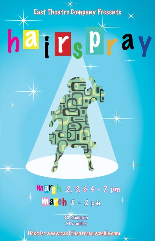
Hairspray Musical Poster
Students will utilize design principles and technical computer skills by participating in a poster design competition using directors notes and research to inform design solutions.
Variation 1
Variation 2
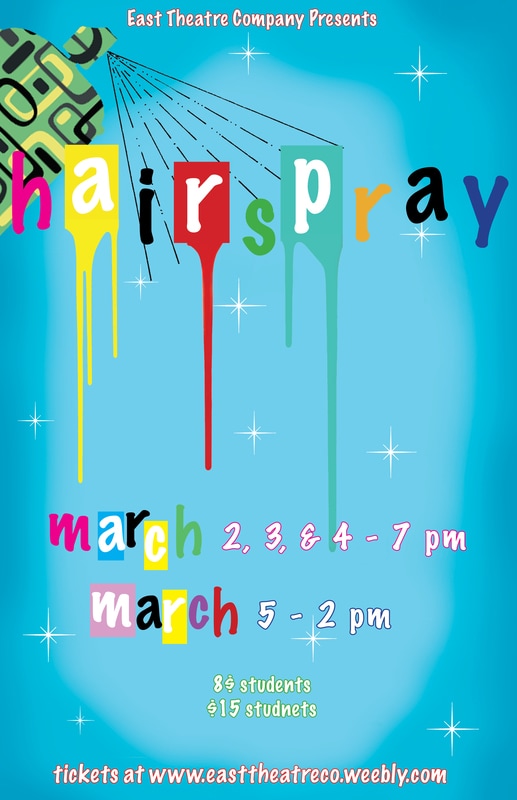
When creating these designs I first did a little research about the time the musical takes place in. The overall theme and tone of the time period is very light, where the youth were trying to not be like their parent's generation. To convey they feeling of the 60's within my poster I incorporated many bright and cheery pastel colors, as well as patterns that were created then.
The most successful part of my design is their ambiguous nature. I looked at many different musical posters for hairspray productions and just other ones in general, and a very common look that occurs in many is none of them are very complicated, many use simple shapes and outlines to convey the feel of the musical. So such in my first one where it just uses the outline of the main character I feel does a really good job of telling what the musical is about but not being too busy and making the poster very visually appealing.
The most successful part of my design is their ambiguous nature. I looked at many different musical posters for hairspray productions and just other ones in general, and a very common look that occurs in many is none of them are very complicated, many use simple shapes and outlines to convey the feel of the musical. So such in my first one where it just uses the outline of the main character I feel does a really good job of telling what the musical is about but not being too busy and making the poster very visually appealing.
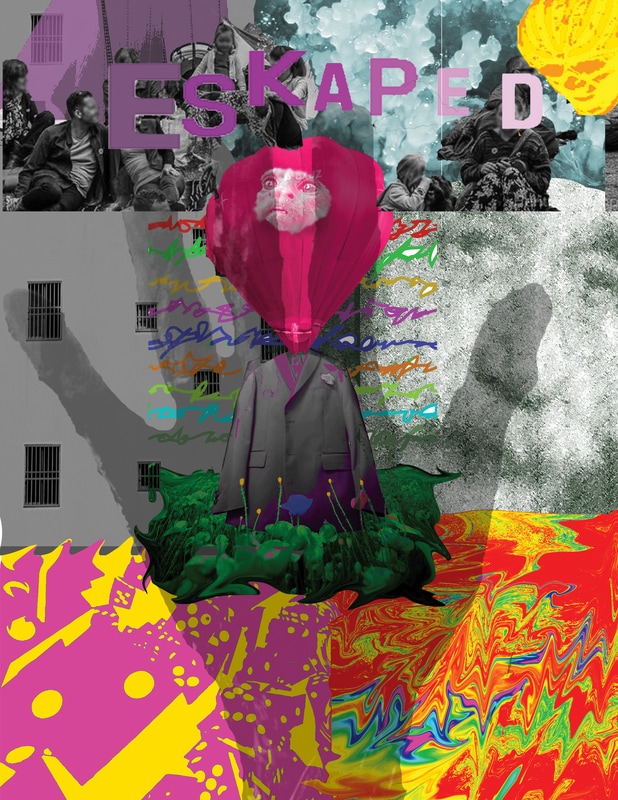
Digital Collage
students will be able to create an original work of art using borrowed and original images by learning to combine and manipulate imagery in Photoshop.
My idea behind this piece is short of based on the idea of falling through life. As we quickly grow older we are just going to that impeding death thing. I don't think it is supposed to be a sad thing, just more objective showing it happen. I wanted to create a narrative.
The main focus of my collage is an animated almost man falling. This is what I did to make my art work very original, I drew him in photoshop and made him my focal point. To make the rest of my work original, I just tried to create a mixture of images that a little strange and hopefully not really every used before.
In terms of photoshop tools I use very constantly, I enjoy using the pencil tool, and being able to manipulate the color of images or just creating my own. I was in drawing and painting last year so I like to do that because it kind of bridges graphic design and drawing.
What makes me the most proud of my artwork is that I feel that I was really able to tell a story with it, and you can very clearly see the message that I'm showing, and I believe it also just looks cool.
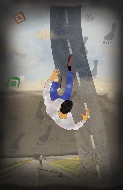
Movie Poster
Students will be able to create an original work of design/art using borrowed and original images by applying digital Photoshop skills.
Sketches
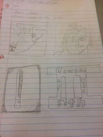
Poster
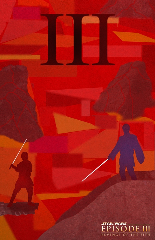
The Idea behind my project was to create an original and very unique poster for the third Star Wars movie, the movie is often ridiculed and is known to be not that great, but I enjoyed it and wanted to create an artistic, simple, poster, using aspects of pop art and cubism.
I first just looked up posters for all of the Star Wars movies, most of the posters for all 7 movies have a very distinct feel and look to them, the vision in my head for this iconic scene in the movie had never done, through my use of color, I was able to capture the theme of the movie, of betrayal, darkness, and hate. All of my imagery in the piece is hand made or distorted so much to make it mine that overall the piece is very unique and original.
The tools I used most was the rectangle tool with the distort transformation tool in order to make the background, and the artistic tools such as the pen too in order to achieve the right colors and shapes within all the forms of my piece, from the silhouette of my figures, to the rocks in the background. The thing I am most proud of this piece is when I first made the poster, it did not flow at all and did not have a good overall look, however I was able to see what things needed to change, and I created this second variation that I'm very happy with, I believe it looks super cool.
Word Play
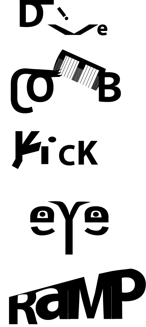
Students will learn how to combine text and imagery to communicate an idea using Illustrator to create vector images.
I believe that with every one of my words you can see how the letters are transformed and manipulated in a way that makes sense and illustrates the word. I also I believe that I was able to choose more original and harder words that required me to be very creative and push myself to use my technical skills.
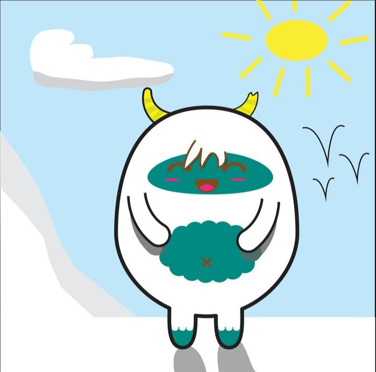
Yeti Illustrator Tutorial
Avatar Design
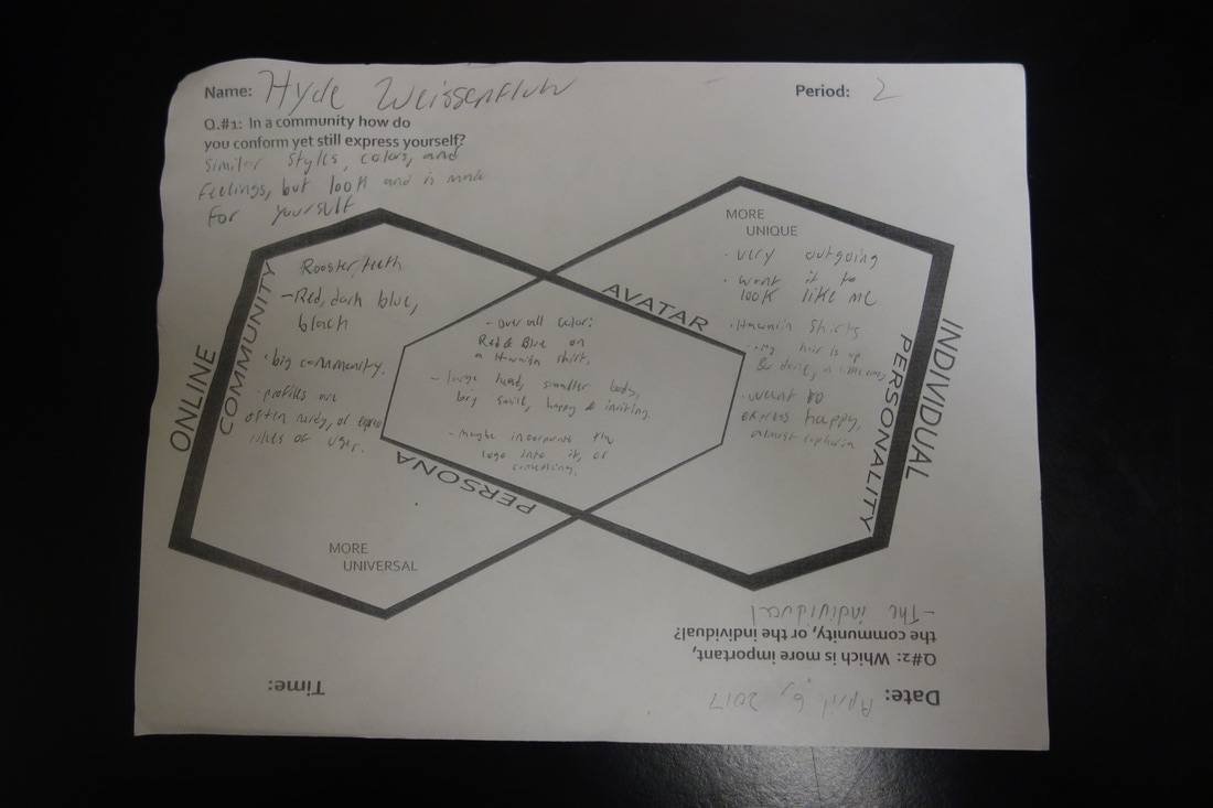
Students will be able visually simplify themselves into an Avatar that fits into the identity of a larger online community while still representing a individual characteristics of themselves
My Avatar mostly meets the individual aspect of the assignment. I took precedent of the individuality part over the online community. However my piece work with almost any social media website, such as roosterteeth.com, my target site, because it shows of the likeness of myself to viewers of my profile as well as you can tell a bit about me from the overall look and apparel of my avatar.
Emoji Design Using Exaggeration
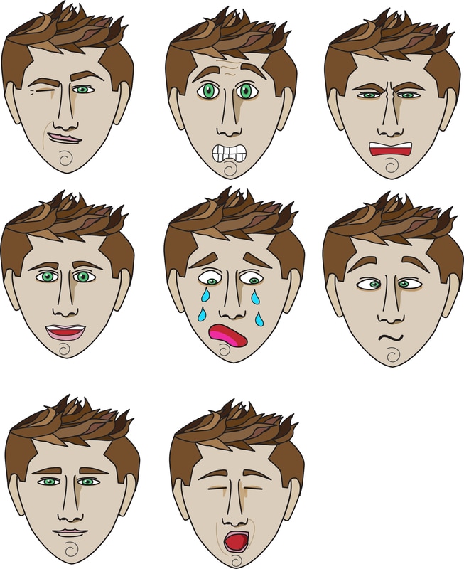
Students will explore exaggeration by creating a series of emojis from their avatar. While attempting to push their artistic abilities, the students wills strive to show command over the toolset being used.
I really Like my emojis because I can separate them and then use them while I am texting my friends as actual emojis. I just used google images for references of people's faces when they feel certain emojis, and then I tried to simplify that and transfer it to my character. To smartly plan this assignment I should have figured out all the emotions I wanted to do before and have reference images and sketches ready.
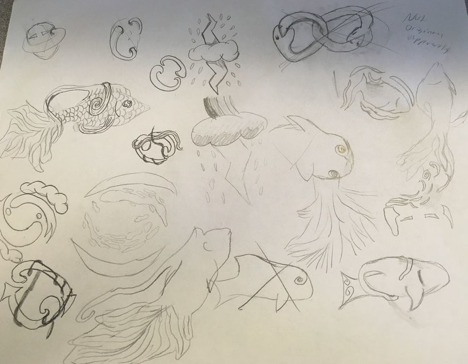
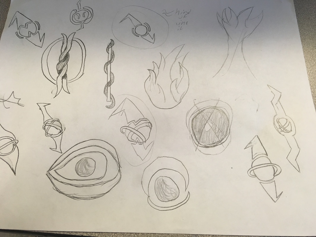
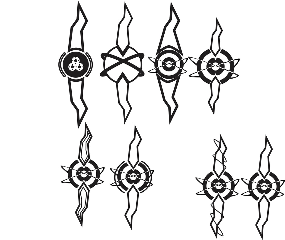
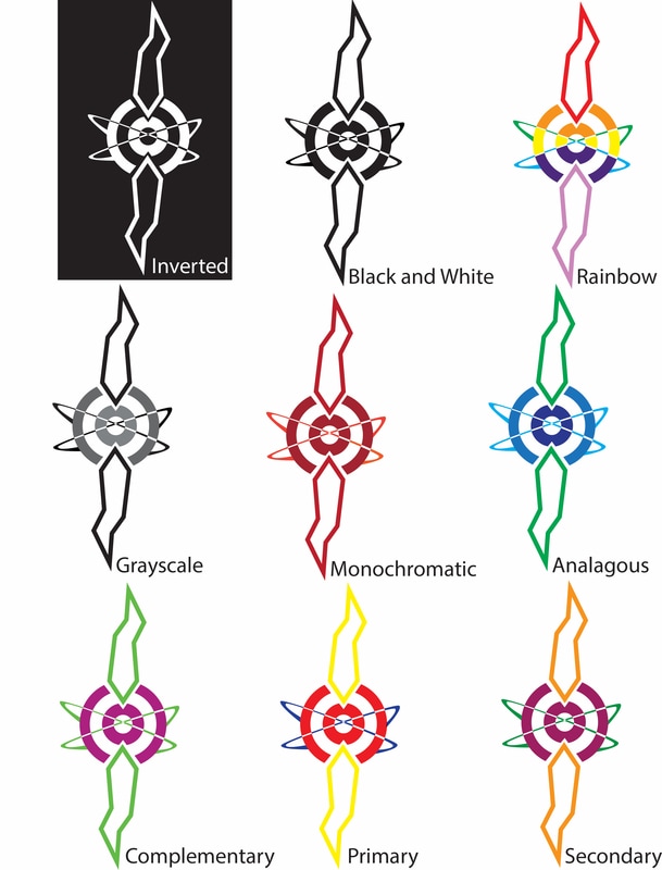
Personal Symbol Design
|
|
|
|
I tried to give my symbol the overall feel of something like the model of an atom. I think my symbol represents me in the small complexities, such as the alternating colors in the orbits or the small spaces between different parts of it. I think overall the Symbol represents me with the feel and movement it expresses. It is not too complicated overall, however it is very exciting and has a lot of movement. I believe the best color scheme for it is the black and white. I think the symbol becomes a little tacky once color is added. Black and white is simple and elegant. My style overall this year has tended to be more minimalistic, with large shapes of one color, so I think this symbol reflects that.
