Graphic Design 1 Semester One
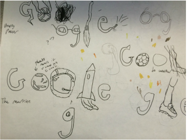
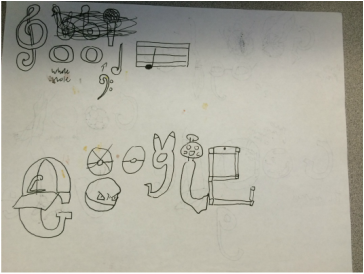
Google Doodle Sketches
Students will be able to demonstrate prior knowledge by creating an analog and digital Google doodle.
|
|
Digital Google Doodle
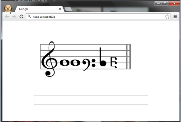
This is my interpretation of a digital google home screen. I am a pretty musical person, I play the piano, and I listen to music every day, I find it to be a great escape from reality, if you don't want to talk to people, you can just listen to music and tune them out. So my theme for my digital image was music. I created this picture in word. I have taken tech applications and word processing, which even though they aren't centered around creating artwork, it gave a great amount of time to explore word and learn it's functions, such as sending images to different layers and making them move freely against word's first instinct of lining them up with text. I took these images from google, removed the back round, and placed them together as so, using the Treble clef as a G, whole notes as O's, the Bass clef as G, a quarter note as L. and a triple quarter note on its side as the E. I enjoy making all kinds of art. I haven't found a certain type I like the best, so as long as I get to be creative and create art I am happy.
Analog Google Doodle
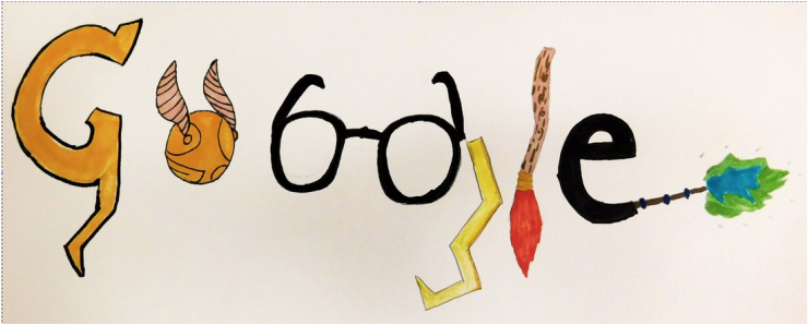
This is my other interpretation of a google home page, drawn by hand. My inspiration for this piece is Harry Potter. I have read the books and watched the movies multiple times, and with the recent release of "The Cursed Child" I thought it would be very relevant. I did the signature lighting bolt, then used other components such as the golden snitch, his glasses, a nimbus 2000, and a want to create the rest of the letters. Here at East, I have taken Drawing and Painting 2 and 3. I really enjoy painting and drawing, with painting being able to get dirty and into your piece, and with drawing, doing incredible pictures with just a tiny little straight instrument. I have never found a specific thing I like to paint though, so I just do what ever I feel like at that point in time.
InDesign Tutorial
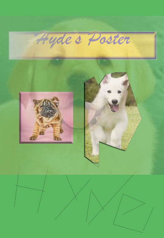
This was just a trial in Adobe InDesign, we watched a how to video explaining some very simple things that can be done within the program, and then we just had to copy it and add a little bit of our own spin to it, so I of course, added an opaque dog.
Social Design Poster
students will be able to demonstrate an understanding of social design and the design cycle through the process of creating social design posters using relevant technologies, and with support from peer design teams.
| hyde_weissenfluh_-_social_design_research_paper.docx |
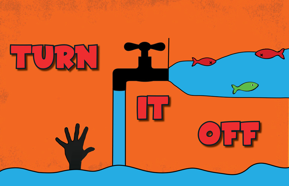
My message was about water conservation, the specific message was about water usage and wasting, telling people to turn off the water, to save and conserve it, because as we waste water we kill fish, and even other people who suffer from doubts. To convey this message I used a combination of text and graphics. The text gave the reader the basic message, to turn off the water, the as the person who is looking at my poster continues to inspect it, they see deeper things, like how it is killing fish and using all of our water supply
I believe that I was very successful with how my text and graphic worked together within my poster. The basic shape that my graphics and text formed together was an X, with the text going corner to corner one way, and the overall flow of the graphic going from opposite corner to corner. This shape then leads to a dynamic composition in which the viewer of the poster’s eyes are focused to the center, and then explore the text first, and then the graphic, understanding more and more as the keep looking and interpreting.
I believe my greatest success is the overall aesthetic of my poster, I went for a poster with lots of simple, bold graphics. I achieved this, everything is basically one color with a bold black outline and everything is a bold, striking color. Some areas I could’ve improved with is maybe specializing the text a little bit more, and adding just a little more details within like the water to make the overall composition and look more exciting and complicated. So it could be simple, yet with some details.
I’d say the best interactions with others in this process was just to walk around the room while everyone was working to see what people were doing. In this way I could see the methods people were using and what their overall goal was, and then I could take all this information and use it in my poster, taking in influences from my fellow classmates. Then I also had my group, who were able to give me advice on my poster, how I could make it better, but also just saying that it is really good, giving me confidence to try certain designs that might be a little out of my comfort zone and knowledge of the computer.
Social Poster Event Poster
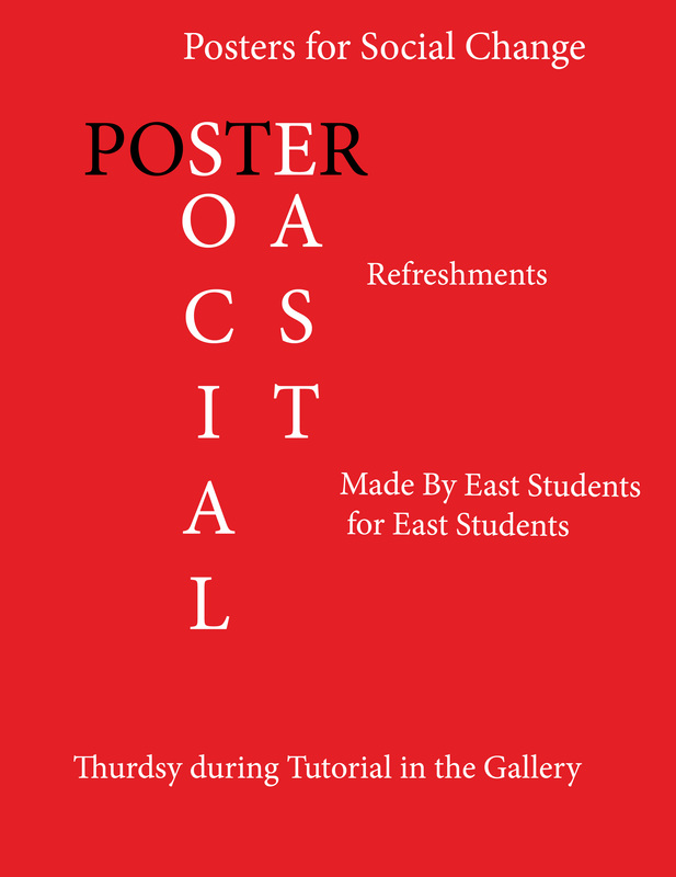
When everyone in our class finished our Social Design Posters, we had a gallery walk in which everyone in the school was invited to come and look at the work we did. For people to know that this was an event, we obviously needed a poster in order to spread the word. I designed this poster, and it became the face for our show, it was hung up all around the school in order to tell about the gallery opening.
Splash of Color Tutorial
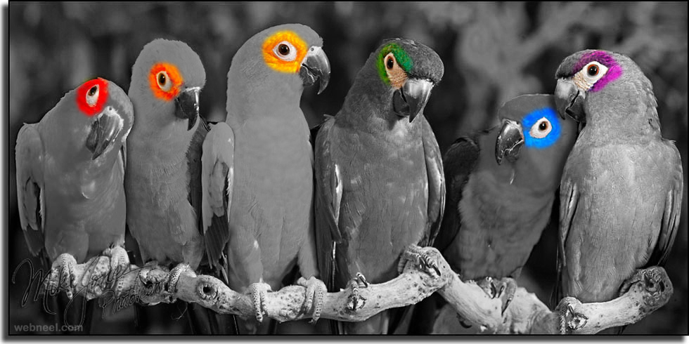
This was a tutorial in photoshop. I learned how to use a layer mask to be able to overlay layers, and then have the color from the one on the bottom show through, letting me create pieces with just some color popping through.
Editorial Design
Students will be able to communicate (through writing & design) their learning about a self-chosen topic in desing using Internet research, tutorials, and class demonstrations to broaden their knowledge and skills.
Sketches
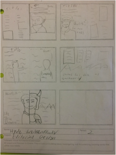
This is where I started brainstorming for my final editorial sheet. I just sketched some ideas for interesting and dynamic design pages.
Final Editorial Variations
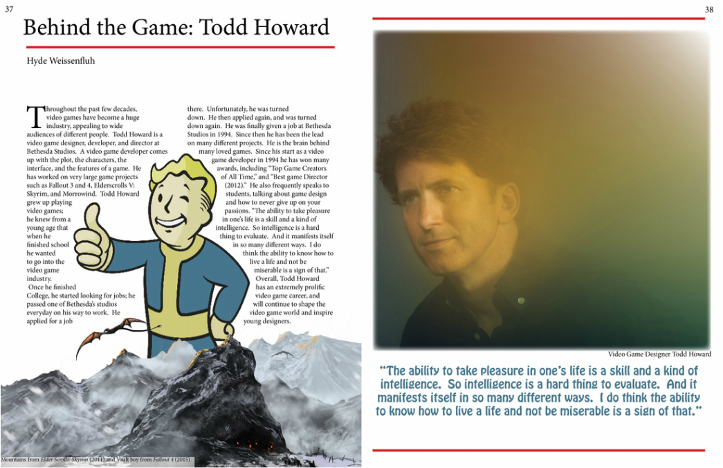
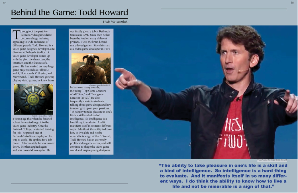
.In this unit we researched different designers and designed a magazine article about them. While looking up different designers, and while looking at my classmates designs, I've started to learn just how big the design industry is. It encompasses so many different areas of media, and is in everything we use. There are clothe designers, video game designer, logo designers, and so much more. Design can be anything. Design is just a broad term that is used in an industry where people are making things to get attention, to catch the eye of the consumer.
The designer I chose, Todd Howard, is a video game designer at Bethesda Studios. In an article about it, it should encompass what he does, so the reader can understand what he does by looking at the design and not just reading the article. To do this, I mostly conveyed what he does through picrtures. Pictures of different video games he's done along with pictures of him creates a clear path to the mind of the reader of what he does. Also both of my articles are very tame, they are organized and proffessional looking, conveying a standard that is also within his games.
I faced a few problems in InDesign while creating this project. Most of my problems stemmed just from not knowing how to do something within the program. However through research and experimentation, I was able to learn how to use new tools in the program, and could create an article that was equivilent to the piece I saw in my head.
With my design, I actually ended up creating about 4 different variations. With the first two, inadvertantly I tried to fit every idea I had into one spread. The result was an article with not very good layout and communication. However, with multiple variations, I was able to spread ideas out onto different spreads, creating more cohesive ones. It also just have me time to have ideas become concrete in my head. When working on the second variation I had a better grip on the project than with the first one. So this lead to later variations gradually becoming better, so I could create the best layout possible.
